Palyoplot 0.0.15 now available

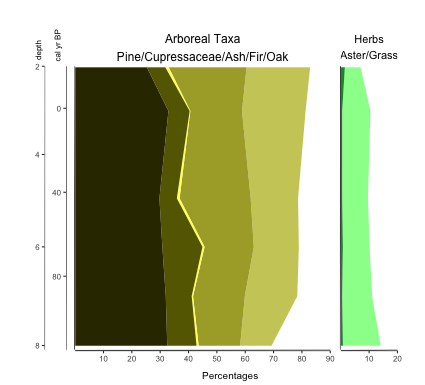
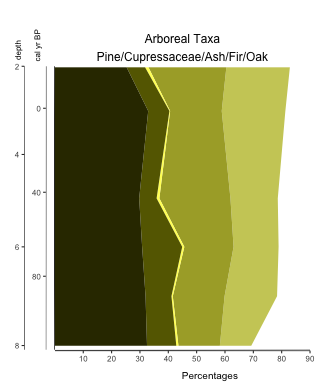
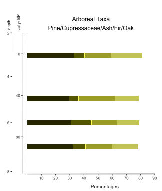
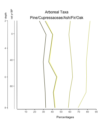
Several bug fixes and lots of updates to the Help files. File to install is at: http://geotechnography.com/samples/palyoplot.palyoplot_0.0.15.tar.gz. Sorry for the delay in updates and whatnot, but between COVID-19 class conversions and going up for tenure I was a bit busy.

I’m planning to have Palyoplot go into Beta soon, so any feedback at all is greatly appreciated. History of versions, changelog, and a revised sample R file are available at: http://geotechnography.com/samples/palyoplot/

Appending Graphs in Palyoplot Tutorial Now Available

We’ve all been there… created a bunch of graphs that now we have to copy/paste together in image editing software. It just disrupts the workflow, you know? I like to make less work for myself. That’s not to say I don’t still need to tweak this in an image editor, but I can at least minimize how often I have to. Enter the ability to append (that means sticking together one after another) graphic into one diagram! The tutorial for how to do so is now available. Here’s a sneak peak of two stacked plots appended into one image (notice, y-axis appears only on the left and is not duplicated for each plot. I give you options like that… 😉 )

Two stacked diagrams appended into one final image

Palyoplot Stacked Diagram Tutorial is Up

Sometimes you just want to stack a bunch of (related) data together for visualization. The tutorial for how to do so with Palyoplot is now up to show you how to do just that! Here’s a sneak peak of what you can create…

Basic Palyoplot Tutorial is Up

Seems I’m being extra productive today. Created a basic tutorial on creating diagrams using Palyoplot’s built-in datasets. It should be enough to get you started with the functionality and exploring how the datasets are setup in R.

To give you a little bit of a sneak peak before heading over there

library(palyoplot)
axis2 = palyoplot_get2ndAxis(interval=2, top=-20, bottom=115, ages=pp_agemodel)
graph1 = palyoplot_plotTaxa(xdata=pp_xdata, ydata=pp_ydata, ylabel="cal yr BP", bottomLabel="Percentages", 
                            colors=pp_colors, y2=axis2, y2label="depth (cm)", fontstyles=pp_fontStyles,
                            taxaGroups=pp_taxaGroups, plotStyle="line"))

Palyoplot is available for alpha testing

I’ve created an R package called Palyoplot (get it? Paleo… palynology… plotting) for creating stratigraphic plots of Quaternary Science data (pollen, charcoal, diatoms, that sort of thing). The thing is, I need testers. Well, more than just myself and former lab mates that I can harangue into trying it out (yes yes, I know you’re counting and haven’t touched R in over a year, but can’t you relearn R really quick and try it out for me?)

Sample diagram created using Palyoplot

So, I’ve created a page that briefly explains Palyoplot, made a Download page with sample files, and am putting out the call. I need a few testers before I’m comfortable releasing to CRAN. If you’re willing to help, drop me a line. If you’re stuck more than 5 minutes, email me. I’ll gladly go through your files and figure out what went wrong. Bonus, your feedback will help with the tutorial I’ll be working to develop.

I look forward to hearing from you!