Palyoplot 0.0.17 Available

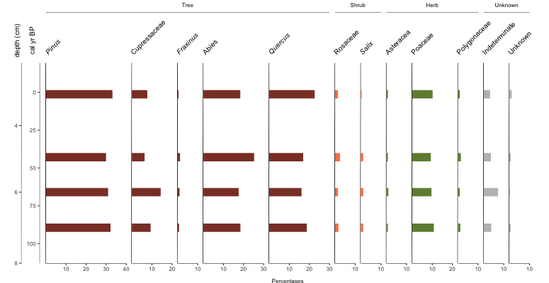
This update fixes the plotting that was broken with the massive ggplot2 3.5.0 updates/improvements. Does not use their improvements beyond just getting the code to work again. Have a known issue where y.break may not be honored as expected in palyoplot_plotData (it might round differently if R thinkings it’s cleaner. Working on it but wanted to get this out). A minor bug fix to palyoplot_plotIndex(), made the tutorial pages on the website formatted consistently, and updated syntax on tutorials to match the latest code version. File to install is at: http://geotechnography.com/samples/palyoplot.palyoplot_0.0.17.tar.gz.

A round of testing and Palyoplot should be Beta. Feedback as always is appreciated. See Palyoplot: R Package in the top-right header for graphical guided tutorials using both built-in and dummy datasets.

History of versions, changelog, and a sample R files are available at: http://geotechnography.com/samples/palyoplot/

Overlaying index plots now available in Palyoplot

That’s right, you heard me. You can now overlay multiple indices on one plot. Why? Because sometimes appending graphs just isn’t good enough and you really need to overlay two index datasets (or more) to see that relationship between them. The tutorial for how to do so is now available, and it leverages all the same styling options as plotting an index. Here’s a sneak peak of two different overlaid plots: one reasonable one with two datasets, and another to show that you can put multiple one one graph. I don’t know why you’d want to do that, but I figured “hey, why not”.

Overlaid Indices (2 indices)
Fig 1. Basic sample of two overlaid indices with dashed zero line
Multiple overlaid indices
Fig 2. Multiple overlaid indices with solid zeroline

Appending Graphs in Palyoplot Tutorial Now Available

We’ve all been there… created a bunch of graphs that now we have to copy/paste together in image editing software. It just disrupts the workflow, you know? I like to make less work for myself. That’s not to say I don’t still need to tweak this in an image editor, but I can at least minimize how often I have to. Enter the ability to append (that means sticking together one after another) graphic into one diagram! The tutorial for how to do so is now available. Here’s a sneak peak of two stacked plots appended into one image (notice, y-axis appears only on the left and is not duplicated for each plot. I give you options like that… 😉 )

Two stacked diagrams appended into one final image

Palyoplot Stacked Diagram Tutorial is Up

Sometimes you just want to stack a bunch of (related) data together for visualization. The tutorial for how to do so with Palyoplot is now up to show you how to do just that! Here’s a sneak peak of what you can create…

Basic Palyoplot Tutorial is Up

Seems I’m being extra productive today. Created a basic tutorial on creating diagrams using Palyoplot’s built-in datasets. It should be enough to get you started with the functionality and exploring how the datasets are setup in R.

To give you a little bit of a sneak peak before heading over there

library(palyoplot)
axis2 = palyoplot_get2ndAxis(interval=2, top=-20, bottom=115, ages=pp_agemodel)
graph1 = palyoplot_plotTaxa(xdata=pp_xdata, ydata=pp_ydata, ylabel="cal yr BP", bottomLabel="Percentages", 
                            colors=pp_colors, y2=axis2, y2label="depth (cm)", fontstyles=pp_fontStyles,
                            taxaGroups=pp_taxaGroups, plotStyle="line"))