Sometimes you just want to stack a bunch of (related) data together for visualization. The tutorial for how to do so with Palyoplot is now up to show you how to do just that! Here’s a sneak peak of what you can create…
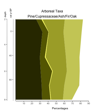
Fig. 3: Alternative custom color application to highlight percentage of Ash 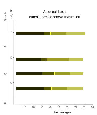
Fig. 4: Custom color application on a stacked bar diagram using Palyoplot 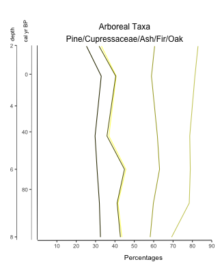
Fig. 5: Custom color application on a stacked line diagram using Palyoplot