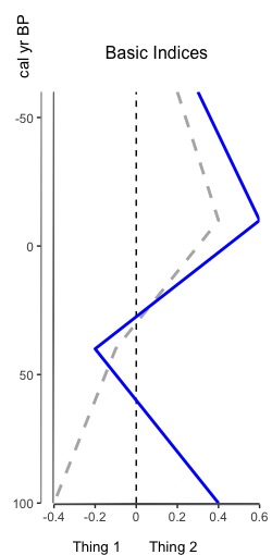
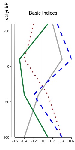
That’s right, you heard me. You can now overlay multiple indices on one plot. Why? Because sometimes appending graphs just isn’t good enough and you really need to overlay two index datasets (or more) to see that relationship between them. The tutorial for how to do so is now available, and it leverages all the same styling options as plotting an index. Here’s a sneak peak of two different overlaid plots: one reasonable one with two datasets, and another to show that you can put multiple one one graph. I don’t know why you’d want to do that, but I figured “hey, why not”.
Month: July 2022
Palyoplot 0.0.16 now available
A few bug fixes, Help file updates, and a new feature — plotting multiple indices on one graph (palyoplot_plotOverlaidIndices()) — tutorial coming soon. File to install is at: http://geotechnography.com/samples/palyoplot.palyoplot_0.0.16.tar.gz.
A round of testing and Palyoplot should be Beta. Feedback as always is appreciated. History of versions, changelog, and a revised sample R file are available at: http://geotechnography.com/samples/palyoplot/
