I don’t know about you, but sometimes having my indices appended next to each other just doesn’t cut it if I’m really trying to examine the relationship between two datasets. Enter palyoplot_plotOverlaidIndices()!
That’s right, with one swift function plot multiple indices (no limit, but don’t make a spaghetti vomit diagram please) on the same diagram. Featuring styling too: style, color, linetype, and barsize. Plus! All the display features you know and love from palyoplot_plotIndex().
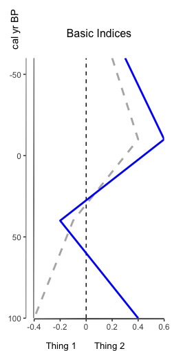
So how do you do it? Let’s check it out! First, some basic data prep (age/depth and two variables of data (xdata1 and xdata2) to plot)
maxAge = 100; #max age to plot
minAge = -60; #min age to plot
ages = data.frame(depth=c(0,20,40,60), age=c(-60,-10,40,100))

xdata1 = c(.2, .4, -.1, -.4)
xdata2 = c(.3, .6, -.2, .4)
Now, to configure the data. This part is very important because you can pass in as many indices as you want. (1) make sure the variable is a list. (2) xdata and ydata are required (and use those keys). (3) the styling keys (style, color, linetype, barsize) are optional, but if you use a key make sure it has a value for each of the indices you’re graphing.
In this example, we’re going to use the styling keys color and linetype — one for each index
data = list(
  xdata = data.frame(xdata1, xdata2),
  ydata = data.frame(ages['age'], ages['age']),
  color = c("grey70", "blue"),
  linetype = c("solid", "dashed")
)
Now, call the function to plot — the graph styling parameters are the same as palyoplot_plotIndex(), which we’re going to use to make it a bit prettier. Returns a gtable object
g = palyoplot_plotOverlaidIndices(data, y.label="cal yr BP", ylim=c(maxAge, minAge),
                                  x.break=.2, xlim=c(-.4, .6),
                                  y.break=50, y.reverse=TRUE,
                                  axis.title.x.hjust = 0.55, title="Basic Indices",
                                  display.width = unit(5, "cm"),
                                  display.height = unit(10, "cm"),
                                  x.label="Thing 1       Thing 2       ")
And with those few lines of code we get the beauty above!
ylim= the limits of the y-axis. You can flip how it draws with y.reversexlim= the limits of the x-axis. You can flip how it draws with x.reversex.label= the text under the x-axis. To align your text, you may need to pad with spaces
Want to go crazy? Plot as many indices as you want (but no spaghetti vomit please). As a proof of concept (this is why we don’t do vomit spaghetti)…
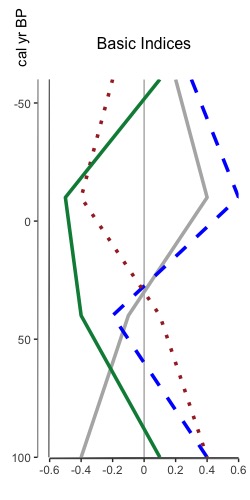
maxAge = 100; #max age to plot
minAge = -60; #min age to plot
ages = data.frame(depth=c(0,20,40,60), age=c(-60,-10,40,100))
xdata1 = c(.2, .4, -.1, -.4)
xdata2 = c(.3, .6, -.2, .4)
xdata3 = c(-.2, -.4, .1, .4)
xdata4 = c(.1, -.5, -.4, .1)

data = list(
  xdata = data.frame(xdata1, xdata2, xdata3, xdata4),
  ydata = data.frame(ages['age'], ages['age'], ages['age'], ages['age']),
  color = c("grey70", "blue", "brown", "springgreen4"),
  linetype = c("solid", "dashed", "dotted", "dashed")
)

g = palyoplot_plotOverlaidIndices(data, y.label="cal yr BP", ylim=c(maxAge, minAge),
                                  x.break=.2, xlim=c(-.6, .6),
                                  y.break=50, y.reverse=TRUE, plot.line.lwd=1.25,
                                  zeroline.linetype = "solid",
                                  zeroline.color="grey70",
                                  axis.title.x.hjust = 0.55, title="Basic Indices",
                                  display.width = unit(5, "cm"),
                                  display.height = unit(10, "cm"))
Not sure why you might want so many, but hey, ya never know.