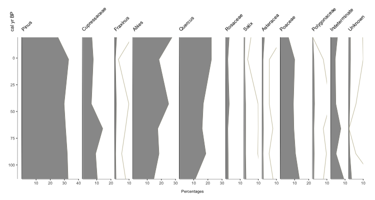
Sometimes you just want to stack a bunch of (related) data together for visualization. The tutorial for how to do so with Palyoplot is now up to show you how to do just that! Here’s a sneak peak of what you can create…
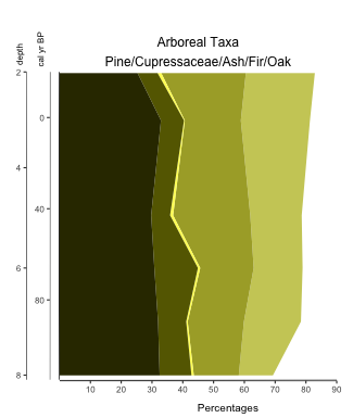
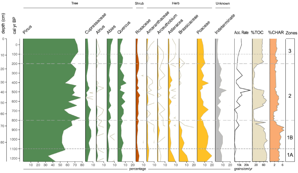
Fig. 3: Alternative custom color application to highlight percentage of Ash
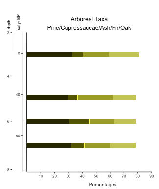
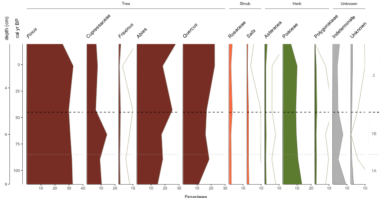
Fig. 4: Custom color application on a stacked bar diagram using Palyoplot
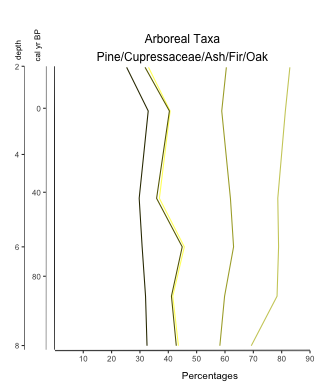
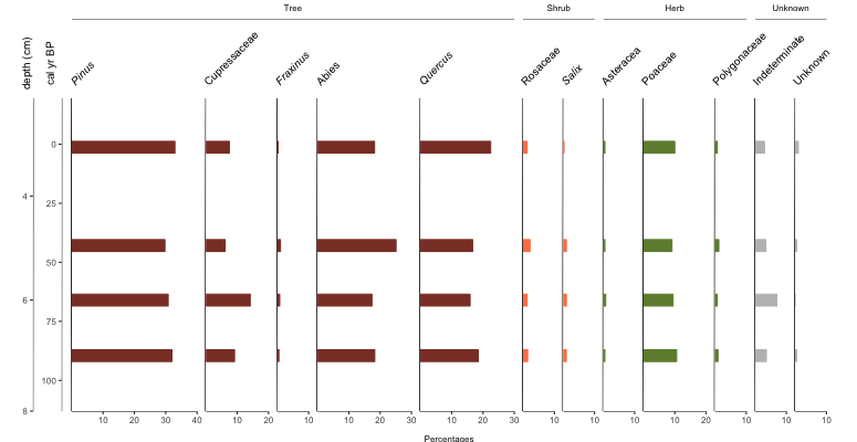
Fig. 5: Custom color application on a stacked line diagram using Palyoplot
Seems I’m being extra productive today. Created a basic tutorial on creating diagrams using Palyoplot’s built-in datasets. It should be enough to get you started with the functionality and exploring how the datasets are setup in R.
I’ve created an R package called Palyoplot (get it? Paleo… palynology… plotting) for creating stratigraphic plots of Quaternary Science data (pollen, charcoal, diatoms, that sort of thing). The thing is, I need testers. Well, more than just myself and former lab mates that I can harangue into trying it out (yes yes, I know you’re counting and haven’t touched R in over a year, but can’t you relearn R really quick and try it out for me?)
So, I’ve created a page that briefly explains Palyoplot, made a Download page with sample files, and am putting out the call. I need a few testers before I’m comfortable releasing to CRAN. If you’re willing to help, drop me a line. If you’re stuck more than 5 minutes, email me. I’ll gladly go through your files and figure out what went wrong. Bonus, your feedback will help with the tutorial I’ll be working to develop.