Basic Palyoplot Tutorial is Up

Seems I’m being extra productive today. Created a basic tutorial on creating diagrams using Palyoplot’s built-in datasets. It should be enough to get you started with the functionality and exploring how the datasets are setup in R.

To give you a little bit of a sneak peak before heading over there

library(palyoplot)
axis2 = palyoplot_get2ndAxis(interval=2, top=-20, bottom=115, ages=pp_agemodel)
graph1 = palyoplot_plotTaxa(xdata=pp_xdata, ydata=pp_ydata, ylabel="cal yr BP", bottomLabel="Percentages", 
                            colors=pp_colors, y2=axis2, y2label="depth (cm)", fontstyles=pp_fontStyles,
                            taxaGroups=pp_taxaGroups, plotStyle="line"))

Palyoplot is available for alpha testing

I’ve created an R package called Palyoplot (get it? Paleo… palynology… plotting) for creating stratigraphic plots of Quaternary Science data (pollen, charcoal, diatoms, that sort of thing). The thing is, I need testers. Well, more than just myself and former lab mates that I can harangue into trying it out (yes yes, I know you’re counting and haven’t touched R in over a year, but can’t you relearn R really quick and try it out for me?)

Sample diagram created using Palyoplot

So, I’ve created a page that briefly explains Palyoplot, made a Download page with sample files, and am putting out the call. I need a few testers before I’m comfortable releasing to CRAN. If you’re willing to help, drop me a line. If you’re stuck more than 5 minutes, email me. I’ll gladly go through your files and figure out what went wrong. Bonus, your feedback will help with the tutorial I’ll be working to develop.

I look forward to hearing from you!

Technology in the Field: Smartphones, Addendum 1

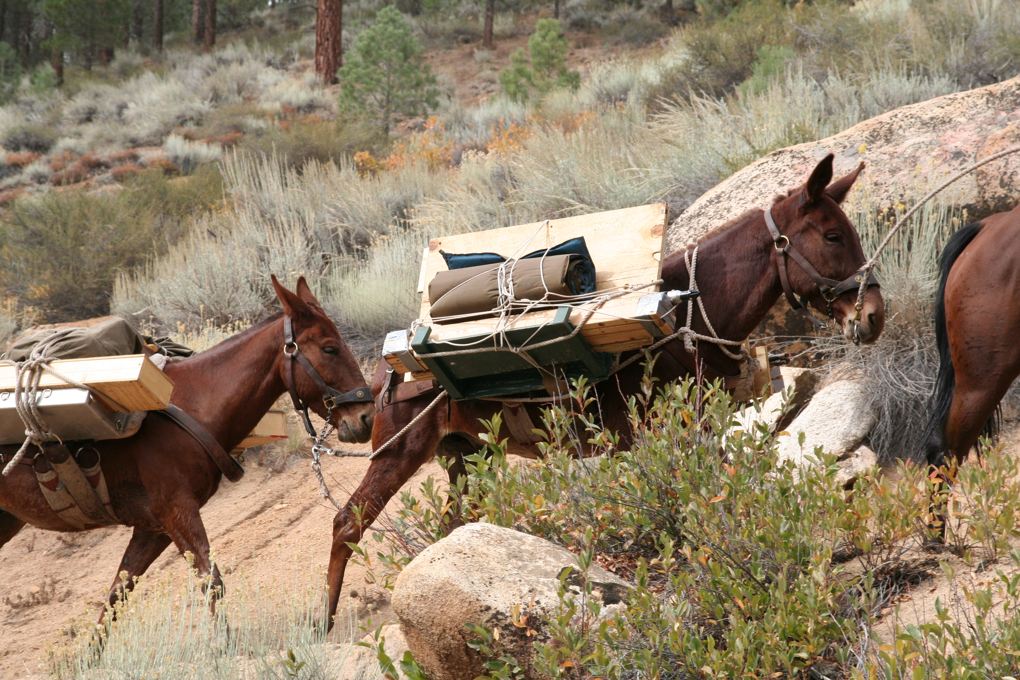
In the previous post I talked about having a smartphone in the field, and how I had not yet tested the waterproofness of the Samsung Galaxy S5. Welp, I accidentally tested it two weeks ago while out in the field on another coring trip. This time in a lake.

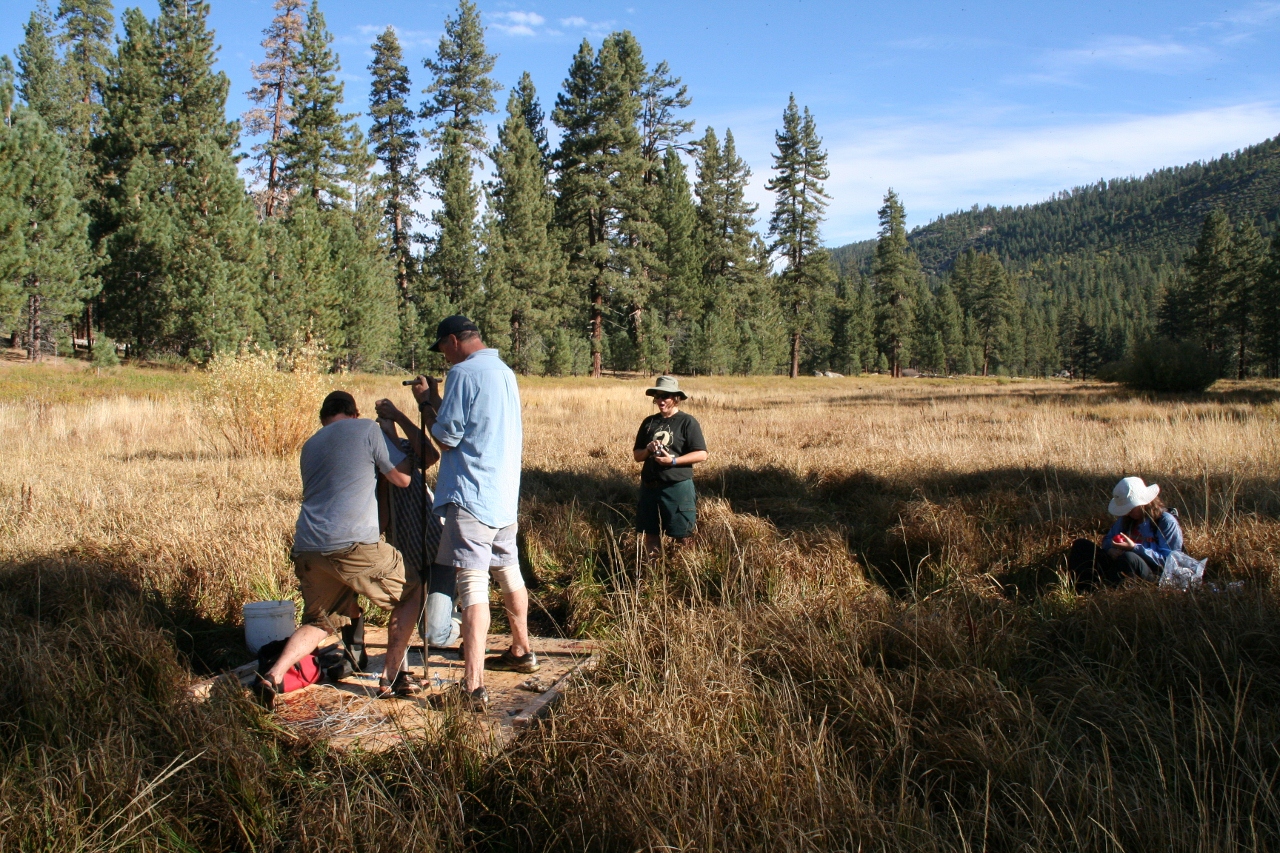
It was my very first lake coring trip, so I was excited to observe how the raft was anchored, positioned, and moved. In my excitement, I forgot that I had my phone in my pocket (as I usually do). Walking along the edge of the lake to position the first anchor point, the bottom suddenly disappeared and I found myself in knee-deep mud and waist-deep water. After fits of laughter and finally getting myself dislodged I remembered my phone (okay, more like 10 minutes later). “Oh no!” was my first thought. “Oh, wait…” was my second. Sure enough, phone coated in mud, wiped off, and still ticking. Yay for field photography when no one else is willing to get their real cameras (or phones) wet!

Continue reading “Technology in the Field: Smartphones, Addendum 1”

Technology in the Field: Smartphones

Once upon a time (back in 2011) I wrote an article on the accuracy of smartphones in the field compared to dedicated GPS units (click here to read it). Coming back from the field has reminded me that nothing’s changed — I’d still rather use my phone than wait for the GPS unit to power up and figure out where I am.

There’s plenty more GPS apps for smartphones now than there was 5 years ago, but I still find myself consistently going back to Maverick (Play Store). It’s simple, lets me drop my waypoint, take a georeferenced picture, add in descriptions, and makes me happy. Used to use OruxMap (Play Store). It has great features, but for some reason I just click on Maverick for fast fieldwork.

It’s nice to see people getting on board with smartphones as GPS, from geography field trips (article) to research investigations (article). Not nearly the backlash when I presented at conferences oh so many years ago (*gasp*! How DARE you say some PHONE is as good as a $2000 Trimble?!??).

Continue reading “Technology in the Field: Smartphones”

How to export ArcGIS to Illustrator

Have you ever made a map in ArcGIS and wondered sadly: “wow, is this really the best I can get my map to look?” (ok, maybe that’s just me). But, if you’ve ever wondered why production quality maps look so much better than yours (let’s ignore a lot of recent journal publications here), it’s because the author cared enough to actually make the map look good. The good news? You can do it too! In this post we’re going to focus on getting your vector map out of ArcMap reliably and in to a real graphics program – Adobe Illustrator. For the following I’m assuming you have a working knowledge of Illustrator.

There are two camps of thought on using ArcMap and Illustrator together: Do most of what you can in Arc first VS. do the minimum in Arc and get it into Illustrator ASAP! What camp you’ll fall in to will likely depend on your experience/comfort with each piece of software. That’s only going to come with experience. So, play around both ways. It might feel like a time sink to mess with the same map at least twice, but in the long run your experimentation will save you a lot of time and grief, and help you develop the workflow that works best for you. I’m not going to tell you what’s best, but there are certain things you need to do regardless – that’s what we’ll focus on.

Continue reading “How to export ArcGIS to Illustrator”