Seems I’m being extra productive today. Created a basic tutorial on creating diagrams using Palyoplot’s built-in datasets. It should be enough to get you started with the functionality and exploring how the datasets are setup in R.
To give you a little bit of a sneak peak before heading over there…
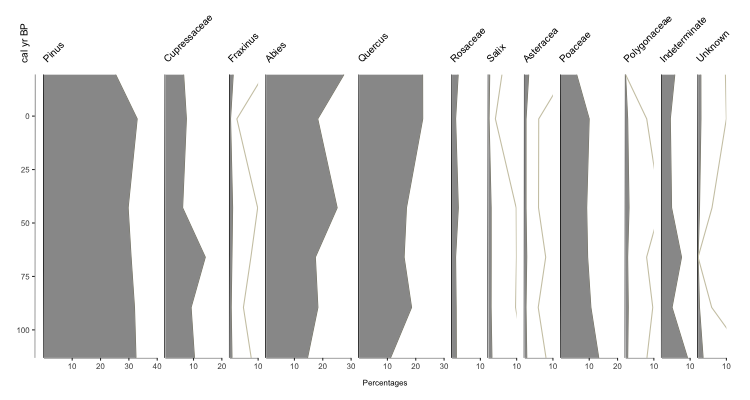
Fig. 1: Basic Palyoplot graph using built-in pollen-based datasets. Extra grey line is 10x exaggeration 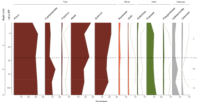
Fig. 4: Basic Palyoplot diagram with double y-axis, italicized genus names, group headings and visual zonation markers and identifiers 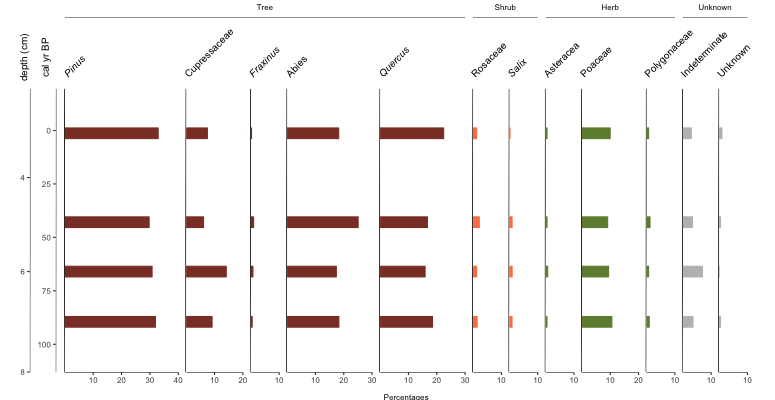
Fig. 5: Basic Palyoplot diagram showing data as bars
library(palyoplot)
axis2 = palyoplot_get2ndAxis(interval=2, top=-20, bottom=115, ages=pp_agemodel)
graph1 = palyoplot_plotTaxa(xdata=pp_xdata, ydata=pp_ydata, ylabel="cal yr BP", bottomLabel="Percentages",
                            colors=pp_colors, y2=axis2, y2label="depth (cm)", fontstyles=pp_fontStyles,
                            taxaGroups=pp_taxaGroups, plotStyle="line"))